After years of arguing for proper use of form elements and link elements, others are finally doing the same. More recently, this includes the articles The Anchor Button: Bad for Accessibility, Bad for Usability by Matt Long and Reinventing the hyperlink (with much humor!) by Heydon Pickering.
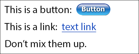
The main point is, please do the basics. When designing a website, ensure controls with button-type behavior (submitting form and opening a modal dialog) are designed as buttons and regular text links (go to an external page, anchor on page, or external document) are designed like text links (such as blue underlined text).
When developing a website, ensure buttons are coded as buttons (the button or input element) and links are coded as links (the anchor element). You could also use ARIA roles to denote button and link, but it’s always better to use the semantic HTML elements.
Here are some reasons why it’s so important:
- accessibility and usability
- provides user with expectation of the control’s behavior
- avoid conflicts with voice-control user agents (speech recognition software) such as Dragon NaturallySpeaking
- a more robust website (support older user agents, non-JS, etc.)
- lighter and less complex code
- more consistent implementation so easier to maintain
Remember that for accessibility, no matter how much ARIA and trickery is done, there will mostly likely still be problems. When blurring the distinction between a button and a link, assistive technology (and/or the user) can be confused as to what’s what. View the beginning of this presentation by Derek Featherstone for a good example of this.
This advice sounds simple, but this elementary guideline is broken quite often; once you start to look, you’ll find it everywhere on the web, especially web apps. There’s no need to create confusion (the design) and to re-invent the wheel (the development). Sticking to the basics will make it easier for everyone, most importantly the user.
For an example of proper implementation, check out Easy Chirp.
Further reading:
- What ARIA does not do by Steve Faulkner (Aug. 2014)
- The Enter Key should Submit Forms, Stop Suppressing it by TJ VanToll (Jan. 2013)
- HTML5 Accessibility Chops: the placeholder attribute by Steve Faulkner (2011, updated 2013)
- You can’t create a button by Nicholas Zakas (Jan. 2013)
- Placeholder Attribute Is Not A Label! (June 2012)
- “Don’t hide your affordances under a bushel” p151 of Don’t Make Me Think Revisited by Steve Krug
Addendum:
- How Our CSS Framework Helps Enforce Accessibility by eBay/Ian McBurnie (Nov. 2014)
- Links, Buttons, Submits, and Divs, Oh Hell by @aardrian (Jan 2016)
- When To Use The Button Element by CSS-Tricks (Jan. 2014)
- But sometimes links look like buttons by Adam Silver (Sep. 2017)
- Anchors, Buttons, And Accessibility by Alex Lande (May 2014)
- Links vs. Buttons in Modern Web Applications by Marcy Sutton (July 2016)
- Enough with the role-play—let’s get back to the basics by Ian Lloyd
- Designing and Coding for Voice by Brian DeConinck (Apr. 2023)
Last updated April 2023.