Categories
aria forms screenreader

Datalist over ARIA combobox

Summary: This article suggests that the custom select dropdown is overused. The ARIA combobox pattern to create one is very complex and has inconsistent support. Instead, the native HTML datalist element should be leveraged to create a similar UI control, and its support is pretty good. Code snippets, keyboard testing results, and basic screen reader testing results are provided.

Customizing a Select is not ideal

Due to extreme complexity, and usually spotty accessibility support, customizing an HTML select element is not recommended. There have been many noble attempts, but at the end of the day, it’s just not worth the many, many hours that web designers and developers and testers dedicate to this. And often it’s not needed; much of its demand is due to ill-perceived competition and designer narcissism. It’s always better to use native HTML.

Autosuggest adds even more complexity to the problem of customizing a native HTML select. The ARIA combobox pattern is appropriate for implementing autosuggest, but it’s inconsistent between ARIA versions, very intricate to implement, and there are many nuances and different levels of support by browsers and screen readers.

Enter datalist

We can address this issue by simply implementing the native datalist HTML element in conjunction with an input element. Doing so (and not customizing via ARIA) eliminates a huge amount of code complexity, code weight, design inconsistency, testing time, etc. The result is a control which functions like an autosuggest dropdown and text can also be entered into the input field.

The datalist element is defined in the spec as:

a set of option elements that represent predefined options for other controls. In the rendering, the datalist element represents nothing and it, along with its children, should be hidden.

Demo of the datalist element. Control appears like a select and has options displayed below.
Example of the datalist element in Chrome.

Datalist support

Datalist has been around for years now, but only recently has browser support and its accessibility been good enough to consider using. Check out datalist on CanIUse.com for info on browser support (that’s a lot of green!)

In a recent Tweet from Paul Adam, he states “HTML <datalist> Tag seems accessible enough now to recommend over an ARIA combobox”. Support could be improved (see testing results below), but all things considered, I agree. His tweet includes a screenshot of VoiceOver using the element, with Safari it appears.

Simple is good

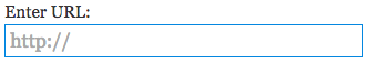
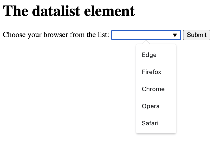
The beauty of the datalist element is simplicity. Straight forward, semantic, and simple HTML – and no JavaScript needed! Here is an example – a label, an input, and the programmatically associated datalist element which contains the options.

<label for="browser">Choose your browser from the list:</label>
<input list="browsers" name="browser" id="browser">
<datalist id="browsers">
  <option value="Edge">
  <option value="Firefox">
  <option value="Chrome">
  <option value="Opera">
  <option value="Safari">
</datalist>

Testing datalist

I’ve done some keyboard and screen reader testing using this datalist test page on CodePen. Support isn’t perfect, but overall it’s pretty good!

Keyboard testing results

After testing with Chrome, Firefox, and Safari, it seems Chrome on both Mac and Windows provides the best keyboard support.

  • Chrome (Mac and Windows):
    • Caret icon appears on focus
    • Option list appears when typing (option list also appears on focus)
    • Option list appears via spacebar
    • Option list appears via down arrow
    • Arrow + Enter to select an option
    • Escape closes the option list
  • Firefox (Mac and Windows):
    • Caret icon NOT displayed on focus nor by default
    • Option list appears when typing
    • Option list DOESN’T appear via spacebar
    • Option list appears via down arrow
    • Arrow + Enter to select an option
    • Escape closes the option list
  • Safari:
    • Caret icon displayed by default
    • Option list appears when typing
    • Option list DOESN’T appear via spacebar (note that with VoiceOver on, it appears with VO + spacebar)
    • Option list DOESN’T appear via down arrow
    • Arrow + Enter to select an option
    • Escape DOESN’T close the option list

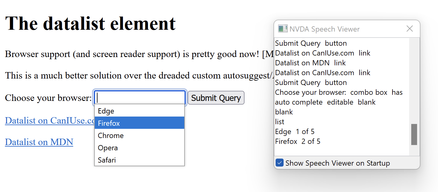
Screen reader testing results

Screen reader usability seems adequate but could use improvement. Here are a few details. No mobile testing was done.

  • NVDA + Firefox
    • Upon focus, outputs “Choose your browser: combo box has auto complete editable blank”
    • Upon opening the option list with the down arrow, outputs “blank” then after down arrow again, “list, Edge 1 of 5”
  • NVDA + Chrome
    • Upon focus, outputs “Choose your browser: combo box has auto complete editable blank”
    • Upon opening the option list with the down arrow, outputs “Autofill  list  expanded, Edge  1 of 5″
  • VoiceOver + Safari
    • Upon focus, outputs “Choose your browser:, list box pop up, edit text”
    • Upon opening the option list, outputs “Suggestions list visible”
  • JAWS + Chrome
    • Upon focus, outputs “Choose your browser: edit combo. To set the value use the Arrow keys or type the value.”
    • Upon opening the option list, outputs “Autofill. List box expanded. Edge, 1 of 5. To move to an item press the Arrow keys.”
Screenshot of the datalist test page. The option list is open and Firefox is selected. NVDA speech viewer displayed.
Navigating the datalist example on the CodePen test page using NVDA on Firefox.

Wrapping Up

Browser support for the HTML datalist element is getting much better, especially on Chrome. Although support isn’t perfect—and nothing is—it’s still pretty good. Is it time to start using datalist instead of heavily customizing similar controls with ARIA? I believe it is, especially considering the vast amount of product development time it would save compared to customization.

Further reading

Categories
aria forms

Accessible Custom Select Dropdowns

In web development, creating custom select dropdowns is difficult. It requires a lot of resources to sufficiently design (annotating the interaction, etc) and develop (the Javascript is fairly complex and the ARIA isn’t easy) and then test. Additional requirements such as option groups and auto-suggest make it even more challenging and time-consuming, and usually frustrating.

Most often the result is not fully accessible; browser and assistive technology is inconsistent; and implementations vary across the web. This is why it’s always better to use native selects with HTML/web. (Native components is also a better choice for native apps.) Don’t forget that HTML selects can be styled with CSS; see these resources by Scott O’HaraRTD, Filament Group, and LugoLabs.

If you must implement a custom select dropdown, you will most like need to use the ARIA listbox rolecombobox role (which specifies a composite widget), and often a combination of those roles. The option role is also required and usually a few other ARIA attributes (for label, state, etc.).

Examples

Here are some great examples which will save many folks a lot of time—if you must customize!

screen shot of custom select; category dropdown and submit button

Other articles

Categories
forms roundup

Accessible Date Pickers

Unfortunately, several shiny HTML5 features (such as the video element), ended up implemented to different levels by browsers, without good accessibility, and without an interface that satisfied designers (a nearly impossible task). This includes the date input.

And a designer should first ask, is a date picker actually needed?

Recently on Twitter, there was some discussion about accessible date picker widgets. Jason Kiss (@JKiss) did some analysis and gave feedback.

https://twitter.com/jkiss/status/720720467829493760 (Tweet no longer exists.)

I felt compelled to list the examples of accessible date pickers mentioned in the Twitter thread, so here they are. Know any other good ones?

PS: In the tweet thread, props to @handcoding, @pauljadam, and @backflip.

Related articles:

Last updated Nov 2023

Categories
captcha forms google

Google’s No Captcha Shows Some Progress

It sure was exciting when Google’s new reCaptcha was announced last week. Dubbed “No Captcha”, the goal of course is to provide a service that determines a human from a bot in order to prevent spam and abuse of online forms.

Derek Feathersone (@feather) from Simply Accessible was one of the first to report its accessibility impact in the blog post On the Accessibility of Google’s No CAPTCHA. The tone of the post is very positive, but the testing cited excludes JAWS with IE (still the most popular screen reader combination) where I found the No Captcha failed miserably. On the bright side, it passes with keyboard-only, Dragon Naturally Speaking, NVDA and the latest VoiceOver.

Two fundamental problems with No Captcha is that it requires JavaScript and it doesn’t work with touch devices.

You can try the No Captcha yourself on a test page hosted by Alastair Campbell (@alastc).

checkbox with label "I am not a robot"
Google’s “No Captcha” reCaptcha

At best, No Captcha simplifies the Captcha experience. At worst, it excludes some users even more than the previous version. Hopefully Google will fix the current issues, especially support for JAWS.

My recommendation is to continue using non-Captcha security techniques; two great articles on how to do so are Spam-free accessible forms by WebAIM and 10 Things to Check Before Using a CAPTCHA by SitePoint.

Related:

Categories
design forms semantic usability

Floated Labels Still Suck

Back in June of 2012, I wrote that the Placeholder Attribute Is Not A Label. The post points out that it’s bad practice to use text to look and behave as a placeholder rather than a label. This is generally known as “floating labels” or “inline labels” (I also call this LAP for short, “labels as placeholders”.) And as you may know, labels are required for accessibility (and usability) as they identify to the user what the input is for. It’s a general best practice to provide a label for every form input.

Unfortunately this design trend still continues even despite repeated concerns on use of placeholder from web development and accessibility experts. Web Axe too maintains that this pattern is bad for a variety of reasons which weren’t fully listed in the original post.

Example of labels acting as placeholders
Don’t do this!

Sources of the Problem

Like many accessibility problems on the web, floated labels can be attributed to multiple issues. Firstly, web designs are trendy, and when a huge well-known company does something like floated labels (i.e. Apple), others follow, even if it’s a poor practice. And if usability testing is done and includes floated labels, it may not provide reliable results because the usability testing most likely:

  1. is not done with long forms (which greatly increases the needs reviewing input and increases the potential of losing context)
  2. is not done with users with disabilities
  3. is not done with users with a situational disability
  4. is done most likely in a controlled environment (latest browser provided, no chance for JS delays nor errors, guided by moderator, not a real product)

The web development community has a lack of adequate HTML skills which also contributes to this problem, so bad that articles recommending basic HTML practices must be written, and frankly, are much needed. A fundamental HTML practice is that a text input requires a label to define what it is. The intent of the placeholder attribute is very often misused; the W3C gives an explicit warning about placeholder:

Use of the placeholder attribute as a replacement for a label can reduce the accessibility and usability of the control for a range of users including older users and users with cognitive, mobility, fine motor skill or vision impairments

List of Pitfalls

Whatever the reason floated labels exist, here is a list of potential issues with the pattern.

  1. The simple fact that since the label disappears when entering text, the user may forget what the input is for. This is especially important when reviewing form data; for users with a cognitive accessibility; and people who may be distracted when completing a form.
  2. This pattern can’t support both a label and a placeholder.
  3. Depending on user’s environment and implementation, there may be a delay in rendering/performance: on page load and in text disappearing after beginning typing. Or even it breaking entirely; see the two examples below.
  4. If an HTML5 placeholder is used for label, older browsers and/or assistive technologies may not support it at all. For example, there is no placeholder support in IE9 and Opera Mini.
  5. Placeholder text is rendered differently across browsers/versions; extra design and development is required to make them accessible (color contrast is usually very low) and have consistent styling. The traditional label is straight-forward and reliable.
  6. Developing this pattern in the best way possible can be fairly complicated and is inconsistent among implementations. Code becomes heavier, more fragile, and more difficult to maintain.
  7. The pattern doesn’t support standards; it doesn’t implement HTML elements and attributes as intended. The W3C HTML5 placeholder specification specifically states it should be a “short hint” of user input and states: The placeholder attribute should not be used as an alternative to a label.
Placeholder! Why U no use label?
A great meme!

In the Wild

No matter how many issues exist, the fact is that the floated label pattern is prominent on the web. Here are a couple of unique examples of this pattern in the wild which have completely gone wrong. This demonstrates only one of many issues with this pattern; sometimes the label doesn’t disappear visually and the label is blocking the view of the input text.

Hootsuite sign-in form; the password input contains both the floated label and the masked password, making it unreadable.
Hootsuite sign-in fail.
In Facebook app, text input for birthday message is blocked by floated label.
Facebook birthday fail in iOS app.

Attempts to Fix

Attempts have been made to help address or fix this problem, but not with much traction. One idea is to ask browsers to darken the placeholder text so that it passes WCAG color contrast requirement. This is a plausible suggestion but not likely to happen, especially any time soon. See below for the CSS fix. And doing so only addresses one issues; it wouldn’t fix the fundamental problem of the label disappearing.

Another attempt is to, upon focus of the input, reduce the text size of the floated label and move it to the bottom of the input field (rather than it disappearing entirely). This is not a feasible solution either as this behavior may cause confusion, requires text size that’s too small, and still adds code weight. Besides, if the label is going to remain visible near the input, it should just be there in the first place.

How to do it right

To create a form that’s robust and accessible, use the label and placeholder as intended:

  • The label element represents a caption in a user interface. It tells the user what the purpose of the input.
  • The placeholder attribute represents a short hint (a word or short phrase) intended to aid the user with data entry when the control has no value.

In the example below, the label “Enter URL” clearly indicates what the text input is for. The placeholder “http://” is a short hint as to what text should be entered. Also, a good guideline for placeholder text is similar to title attributes: only use them for supplementary information, not required information.

A text input with label "Enter URL" above the input and http:// as placeholder value.
Example of recommended use of input label and placeholder.

An exception to always displaying a visible label may be the search input where an icon (such as a magnifying glass) and the location of the form on the page visually denotes it’s meaning sufficiently. A visually hidden label is still required.

To better support mobile devices and screen enlarging tools, place the label above the input (as opposed to the left).

If using a placeholder (hopefully for the right reason), use CSS to darken the light grey so that it adequate color contrast. Here’s an example:

::-webkit-input-placeholder { /* WebKit browsers */
    color:    #666;
}
:-moz-placeholder { /* Mozilla Firefox 4 to 18 */
   color:    #666;
   opacity:  1;
}
::-moz-placeholder { /* Mozilla Firefox 19+ */
   color:    #666;
   opacity:  1;
}
:-ms-input-placeholder { /* Internet Explorer 10+ */
   color:    #666;
}

Summary

Please don’t use “floated labels” or “labels as placeholders” technique; it can break the user experience for a large variety of reasons. Use the label element and placeholder attribute as intended. Use CSS to ensure placeholder text has adequate color contrast.

Further Reading