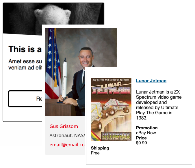
Within a web development organization, it’s ideal to maintain (and enforce usage of) design patterns and a components library. And they should work together; design patterns create consistency among visual elements across projects and the components library creates consistent implementation of those patterns during development. This is especially important on several levels including accessibility.
Here is an extensive list of recommended code libraries, patterns, and design systems. It’s one list instead of separating by category as many have elements of each. There are also some related articles below. Please leave a comment for any updates, corrections, additions, etc.
- U.S. Web Design Systems from United States government
- CMS Design System by U.S. federal government website; applied to HealthCare.gov and Medicare.gov; open-source
- Government Service Design Manual (UK)
- GOV.UK Design System — and blog post Introducing the GOV.UK Design System
- ADDED Oct 2023: W3C design system
- BBC GEL
- Australian Government Design System
- Online Accessibility Toolkit by The Government of South Australia
- Added Mar 2024: Component library from The City of Calgary
- AccDC Technical Style Guide by WhatSock/Bryan Garaventa
- Accessible_Components by Scott O’Hara
- No Style on GitHub by Adam Silver
- MIND Patterns from eBay by eBay/Ian McBurnie
- Cauldron React: Accessible Components Library by Deque Systems
- Code Library by Deque University
- Tenon-UI accessible React components library
- Foundation for Sites by ZURB
- A11Y Style Guide by @CarieFisher
- Demos by Web Overhauls by Web Axe author @DennisL
- Modern Web Accessibility Demos by @PaulJAdam
- Accessible Solutions by @haltersweb
- Vuetensils – A reportedly accessible component library for Vue.js
- Lightning Design System by Salesforce
- Polaris by Shopify
- Rivet Design System by Indiana University
- Lion Web Components by ING Bank; Lion on GitHub
- Chakra – React component library by Segun Adebayo
- Web Experience Toolkit (WET) by Government of Canada
- Cedar by REI
- Access & Use
- Teach Access Tutorial
Related resources:
- W3C WAI-ARIA Authoring Practices – Design Patterns and Widgets
- Web Accessibility Tutorials by W3C WAI
- Inclusive Components article series by Heydon Pickering
- Design Patterns for [UK] Government Services UXPA 2016 (Slideshare) by Caroline Jarrett
- Style Guide Best Practices by Brad Frost
- Creating A Living Style Guide: A Case Study by Steven Lambert
- Website Style Guide Resources – long list of real life pattern libraries, code standards documents and content style guides.
- Design Systems vs. Pattern Libraries vs. Style Guides – What’s the Difference? by UXPin
- Scaling accessibility with a design system by Geri Reid
- accessible-slick – the last (accessible) carousel you’ll ever need, by Accessible360
