Categories
screenreader survey webaim

WebAIM Screen Reader User Survey 10

Results of the 10th WebAIM Screen Reader User Survey are now published (Feb 22, 2024). Thank you WebAIM for continuing this valuable research and other research such as the WebAIM Million and the Survey of Web Accessibility Practitioners.

Highlights

As with previous surveys, WebAIM announced the results in a blog post containing notable items which include:

  • JAWS remains the highest reported primary desktop/laptop screen reader at 40.5% of respondents, though usage dropped compared to NVDA which is now the primary screen reader for 37.7% of respondents. VoiceOver usage remains relatively stable at 9.7%.
  • JAWS with Chrome, NVDA with Chrome, JAWS with Edge, and NVDA with Firefox are the most common screen reader/browser combinations.
  • 91.3% of respondents use a screen reader on a mobile device, with VoiceOver being the most popular by far at 70.6%.
  • Only 34.6% of respondents indicated that web accessibility has improved over the last year, a decrease from 39.3% in 2021.
  • Navigating through headings on a page remains by far the most common (71.6%) method of exploring page content. Heading levels (heading 1, heading 2, etc.) are reported as being very useful.

Self Describing

Not code-related, but another interesting noted item in the survey involves the trend of people describing their visual appearance to user at the beginning of a presentation (such as “I’m a dark haired white woman in my 40s wearing glasses and black lipstick”).

68.2% of respondents indicate that individuals should not describe what they look like during a virtual meeting or webinar.

My suggestion is to refrain from doing so.

Problematic Items

The most problematic items reported by screen reader users are as follows. WebAIM states the items are “largely unchanged over the last 14 years”.

  1. CAPTCHA – images presenting text used to verify that you are a human user
  2. Interactive elements like menus, tabs, and dialogs do not behave as expected
  3. Links or buttons that do not make sense
  4. Screens or parts of screens that change unexpectedly
  5. Lack of keyboard accessibility
  6. Images with missing or improper descriptions (alt text)
  7. Complex or difficult forms
  8. Missing or improper headings
  9. Too many links or navigation items
  10. Complex data tables
  11. Inaccessible or missing search functionality
  12. Lack of “skip to main content” or “skip navigation” links

WebAIM web accessibility in mind

Categories
stats webaim

The WebAIM Million—Updated

The WebAIM Million report, an accessibility analysis of the top 1,000,000 home pages, has been recently updated. Here’s a summary of the update from WebAIM. Sadly, per the report data, the state of web access hasn’t improved much, and has actually worsened overall.

The number of errors increased 2.1% between February 2019 and February 2020.

Below are key points, notes, a call to action, and related tweets.

WebAIM web accessibility in mind

Key Data Points

  • Detectable WCAG failure rate rose from 97.8% to 98.1%.
  • The most common errors:
    • Low contrast text
    • Missing alternative text for images
    • Empty links
    • Missing form input labels
    • Empty buttons
    • Missing document language
  • Home pages with ARIA present averaged 60% more errors than those without.
  • 56% of the 3.4 million form inputs identified were unlabeled (either via <label>, aria-label, or aria-labelledby).
  • Only 128,054 (6.8%) of the tables had valid data table markup.
  • Website homepages using Vue.js had a whopping 76.2 errors per page.
  • 10.8% of home pages had a “skip” link present. However, 11.1% of these links were broken.

Notes

  • This study was done using an automated tool which is capable of detecting only a portion of actual accessibility issues/errors. Actual accessibility errors is certainly much higher. (Even after considering that there may be some false positives from automated testing.)
  • When we should be simplifying content, home page complexity increased 10.4% in 12 months, from an average of 782 elements per page to 864.
  • I wrote about the first report and related issues last year — About the HTML Epidemic, WebAIM “Million” Report, and Teach Access (March 2019).

Call for Action

Developers need to do better with accessibility, and using semantic HTML. The poor results of this report are just not acceptable; it’s poor craftsmanship and poor quality of work. Devs can start improving by:

Tweets

Categories
html5 stats webaim

About the HTML Epidemic, WebAIM “Million” Report, and Teach Access

It’s been about a dozen years since I first realized that there is a world-wide HTML epidemic. Although I speak about the importance of semantic markup and tweet about it often, I wish I’d written specifically about it before. Thankfully others have such as Bruce Lawson, Manuel Matuzovic, and Laura Kalbag.

Web developers overwhelmingly fail when it comes to implementing semantic HTML, whether they actually know how to or not. There are many negative ramifications of this in the areas of device interoperability, reader modes, converting to PDF and EPUB formats, SEO, graceful degradation, code consistency/maintenance, and demonstrating professionalism. But particularly web accessibility.

WebAIM Million

Recently, WebAIM published a report analyzing the accessibility of the top one million website homepages in the world, called The WebAIM Million. This is striking empirical data on how poor accessibility is and how poor the quality of HTML is on the Web. For example, here are some figures from the study.

  • There was an average of 59.6 [accessibility] errors per page.
  • 97.8% of home pages had detectable WCAG 2 failures.
  • 5 of the top 6 issues were due to solely to improper HTML (missing alternative text for images, empty links, missing form input labels, missing document language, empty buttons).
  • 2,099,665 layout tables were detected compared to only 113,737 data tables (note that tables are for data, not layout).
  • On average, home pages had 36 distinct instances of text with insufficient contrast.

This is obviously bad. And, it’s important to point out that the study was done using an automated tool, which is capable of detecting only a portion of actual accessibility issues/errors. I estimate that the amount of issues would at least double or even triple if full audits were done.

Also, as a result of web developers’ poor HTML implementation, accessibility consultants are increasingly required to teach HTML to web developers rather than address “actual” accessibility issues.

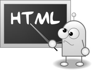
illustration of the letters HTML written on a chalkboard with confused cartoon-like character pointing to it

Resolving the HTML Epidemic

This is obviously a huge problem that must be addressed. What can we do to help resolve this HTML epidemic?

Digital accessibility must be considered when hiring and training employees. Accessibility must be considered when creating a web-based product. Accessibility must be a part of ongoing training for web professionals. Accessibility needs to be taught in education.

An organization called Teach Access (@teachaccess) is helping in some of these areas. Teach Access is a group of tech companies (including Apple, Google, LinkedIn, Adobe, and Microsoft) which is preparing designers, engineers and researchers to think and build inclusively. They have several initiatives including Faculty Grants and a web accessibility tutorial. And another way to fight the good fight for HTML semantics and accessibility is to become a member of Teach Access.

Teach Access is in partnership with PEAT (Partnership on Employment and Accessible Technology) which is a program funded by the Office of Disability Employment Policy, U.S. Department of Labor.

Teach Access logo

If you’re involved in education, please reach out to teachers and professors about Teach Access and about digital accessibility in general. HTML and web design are often part of computer science, software engineering, and mass media, advertising, and news programs. You can also offer to give a guest lecture.

If you have further ideas on how to improve the use of HTML semantics (and web accessibility), please leave in a comment on this post.

Directly Related Articles

More Related Articles

Related Tweets

Categories
"assistive technology" screenreader survey webaim

Assistive Technology Surveys

Digital accessibility experts are often asked about the usage of screen readers and assistive technologies. For example, one will often ask “What’s the most popular screen reader?” This is difficult (if not impossible) to determine technically, but also has privacy implications and other problems.

The following two surveys provide great data and are provided by very reputable organizations. Keep in mind though that the respondents were not controlled and the sample sizes are relatively low.

Are you aware of any other recent surveys?

Related:

A person using a laptop computer wearing headphones and touching a braille output device.
A person using assistive technology.
Categories
design tab usability webaim

About Carousels and ARIA Tabs

Jared Smith (@jared_w_smith) of WebAIM recently launched a clever web page on why carousels are not good practice called Should I Use A Carousel? (which totally went viral on its launch day!) There is a slide deck Keyboard and Interaction Accessibility Techniques (on Slideshare) for which this website was made. I was fortunate enough to see Jared present this at Open Web Camp 5 July 13 at PayPal.

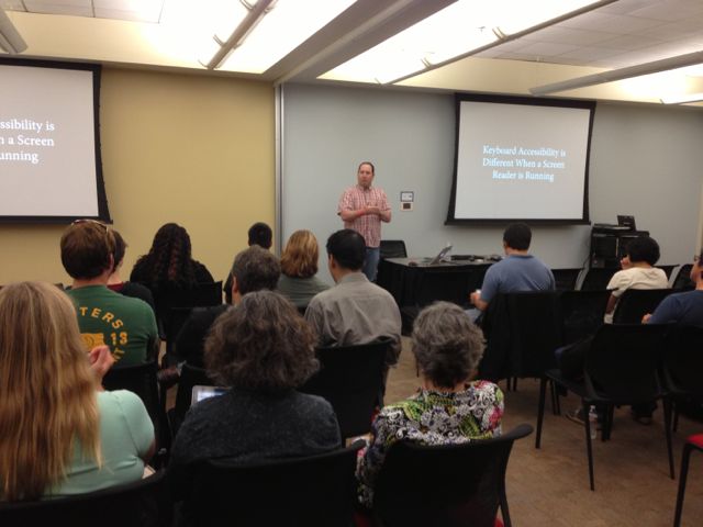
Jared presenting at OWC5

I don’t think that a carousel itself is super terrible. But in my experience, carousels are hardly ever coded with accessibility in mind and hardly ever designed with decent usability. In addition, supporting smaller devices is an issue and coupled with the poor usability data, carousels are overall a bad idea. If you absolutely must implement a carousel, here are some design/interaction tips:

  • Let the user start the carousel animation.
  • Give the user the ability to pause the carousel.
  • Ensure the controls have textual labels.
  • Ensure the control of the currently displayed panel is indicated visually and programmatically.
  • Ensure the controls have ample hit areas (for mobile, fine motor disability).

On the development side, a carousel can be challenging to make screen reader accessible. It seems that the most straight forward approach is to use the ARIA tab model which is pretty straight forward and fun to do! Here’s a summary of what to do in the markup:

  • Each carousel content container has a role of tabpanel.
  • Each control, typical designed as dots, has a role of tab.
  • The container of the controls/tabs has a role of  tablist.
  • Add aria-labelledby to the tabpanels which point to the id of the associated control/tab.
  • To each control/tab, add aria-controls (which points to the id of the associated tabpanel) and aria-selected (boolean) attributes.

Here are some code resources to help make sense of this. This first by Marco may be most relevant:

More:

Updated August 2017