As with previous surveys, WebAIM announced the results in a blog post containing notable items which include:
JAWS remains the highest reported primary desktop/laptop screen reader at 40.5% of respondents, though usage dropped compared to NVDA which is now the primary screen reader for 37.7% of respondents. VoiceOver usage remains relatively stable at 9.7%.
JAWS with Chrome, NVDA with Chrome, JAWS with Edge, and NVDA with Firefox are the most common screen reader/browser combinations.
91.3% of respondents use a screen reader on a mobile device, with VoiceOver being the most popular by far at 70.6%.
Only 34.6% of respondents indicated that web accessibility has improved over the last year, a decrease from 39.3% in 2021.
Navigating through headings on a page remains by far the most common (71.6%) method of exploring page content. Heading levels (heading 1, heading 2, etc.) are reported as being very useful.
Self Describing
Not code-related, but another interesting noted item in the survey involves the trend of people describing their visual appearance to user at the beginning of a presentation (such as “I’m a dark haired white woman in my 40s wearing glasses and black lipstick”).
68.2% of respondents indicate that individuals should not describe what they look like during a virtual meeting or webinar.
My suggestion is to refrain from doing so.
Problematic Items
The most problematic items reported by screen reader users are as follows. WebAIM states the items are “largely unchanged over the last 14 years”.
CAPTCHA – images presenting text used to verify that you are a human user
Interactive elements like menus, tabs, and dialogs do not behave as expected
Links or buttons that do not make sense
Screens or parts of screens that change unexpectedly
Lack of keyboard accessibility
Images with missing or improper descriptions (alt text)
Complex or difficult forms
Missing or improper headings
Too many links or navigation items
Complex data tables
Inaccessible or missing search functionality
Lack of “skip to main content” or “skip navigation” links
Strikethrough <s> is an HTML element to indicate text that is crossed out – usually indicated visually with a line through the middle of the text. The W3C definition is:
The s element represents contents that are no longer accurate or no longer relevant.
On e-commerce websites, a strikethrough element is often used to indicate a price is no longer valid and often has a reduced price next to it.
The problem is that most screen readers don’t output the strikethrough semantics. This can be very problematic to the blind user since they won’t know which price is valid. Most in-line semantic elements such as <em> and <mark> are not conveyed to screen readers actually. For more on that, reference the article Screen Readers support for text level HTML semantics by TPGi.
Let’s examine four test cases and the level of support. Note that the strikethrough element is mapped to the deletion ARIA role which we’ll use in test Scenario 2.
Test Cases
Four code scenarios were tested against 6 screen reader/browser/OS combinations including VoiceOver, NVDA, JAWS, and TalkBack. The actual test cases used are in the second portion of the CodePen Negative number and strikethru tests.
Scenario 1: strikethrough element only
Price: $200 $100
Price: <s>$200</s> $100
The plain old semantic HTML—an S element around the text. This is obviously the ideal code, but support isn’t quite there yet. Only NVDA and TalkBack passed.
Scenario 2: strikethrough with ARIA ‘deletion’ role
Price: $200 $100
Price: <s role="deletion">$200</s> $100
This is similar to Scenario 1, but with the addition of role=”deletion”. The test results were similar to without the role. The only difference is that VoiceOver on iOS also passed.
Scenario 3: strikethrough with visually hidden text
This test case uses the old school technique of visually hiding text via CSS. “Original price” outputs before the price with the strikethrough, and “Sale price” outputs before the valid price.
All screen readers passed this scenario.
Scenario 4: strikethrough with visually hidden pseudo-content
The fourth test case has the same HTML has Scenario 1. But then applies a brilliant method by Adrian Roselli introduced in 2017 in the article Tweaking Text Level Styles. Pseudo-content (creating a textual phrase via CSS) is used to indicate when the strikethrough starts and ends.
There are a couple issues to mention with this approach:
Since NVDA now supports the strikethrough tag, it indicates the semantics twice — both the S element semantics (“deleted”) and the pseudo-content (“start of stricken text”) which creates ambiguity for the user.
Oddly, the double semantics is not conveyed by TalkBack which did pass the previous three scenarios.
With JAWS, the output is broken up with multiple stops which makes it difficult to follow. (Changing the brackets to parentheses might help.)
This technique technically works for all screen readers, but the user experience is very confusing for NVDA users.
Test Results
Does screen reader output “deleted”, “stricken”, or similar?
Test Results
iOS + Safari + VO
MacOS + Safari + VO
Android + Chrome + TalkBack
Win + Chrome + NVDA
Win + Firefox + NVDA
Win + Chrome + JAWS
Scenario 1
No
No
Yes
Yes
Yes
No
Scenario 2
Yes
No
Yes
Yes
Yes
No
Scenario 3
Yes
Yes
Yes
Yes
Yes
Yes
Scenario 4
Yes
Yes
Yes
Yes
Yes
Yes
Conclusion
NVDA has the best support for <s>, the strikethrough element. For now, to best support screen readers overall, we should continue to use Scenario 3 — strikethrough with visually hidden text — to programmatically convey strikethrough semantics. Doing so will ensure that everyone understands strikethrough semantics while browsing the web which often means knowing the correct price of a product or service.
Summary: This article suggests that the custom select dropdown is overused. The ARIA combobox pattern to create one is very complex and has inconsistent support. Instead, the native HTML datalist element should be leveraged to create a similar UI control, and its support is pretty good. Code snippets, keyboard testing results, and basic screen reader testing results are provided.
Customizing a Select is not ideal
Due to extreme complexity, and usually spotty accessibility support, customizing an HTML select element is not recommended. There have been many noble attempts, but at the end of the day, it’s just not worth the many, many hours that web designers and developers and testers dedicate to this. And often it’s not needed; much of its demand is due to ill-perceived competition and designer narcissism. It’s always better to use native HTML.
Autosuggest adds even more complexity to the problem of customizing a native HTML select. The ARIA combobox pattern is appropriate for implementing autosuggest, but it’s inconsistent between ARIA versions, very intricate to implement, and there are many nuances and different levels of support by browsers and screen readers.
Enter datalist
We can address this issue by simply implementing the native datalist HTML element in conjunction with an input element. Doing so (and not customizing via ARIA) eliminates a huge amount of code complexity, code weight, design inconsistency, testing time, etc. The result is a control which functions like an autosuggest dropdown and text can also be entered into the input field.
The datalist element is defined in the spec as:
a set of option elements that represent predefined options for other controls. In the rendering, the datalist element represents nothing and it, along with its children, should be hidden.
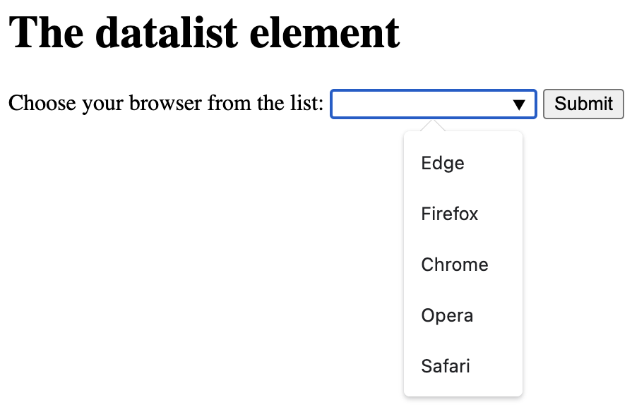
Example of the datalist element in Chrome.
Datalist support
Datalist has been around for years now, but only recently has browser support and its accessibility been good enough to consider using. Check out datalist on CanIUse.com for info on browser support (that’s a lot of green!)
In a recent Tweet from Paul Adam, he states “HTML <datalist> Tag seems accessible enough now to recommend over an ARIA combobox”. Support could be improved (see testing results below), but all things considered, I agree. His tweet includes a screenshot of VoiceOver using the element, with Safari it appears.
The beauty of the datalist element is simplicity. Straight forward, semantic, and simple HTML – and no JavaScript needed! Here is an example – a label, an input, and the programmatically associated datalist element which contains the options.
<label for="browser">Choose your browser from the list:</label>
<input list="browsers" name="browser" id="browser">
<datalist id="browsers">
  <option value="Edge">
  <option value="Firefox">
  <option value="Chrome">
  <option value="Opera">
  <option value="Safari">
</datalist>
Testing datalist
I’ve done some keyboard and screen reader testing using this datalist test page on CodePen. Support isn’t perfect, but overall it’s pretty good!
Keyboard testing results
After testing with Chrome, Firefox, and Safari, it seems Chrome on both Mac and Windows provides the best keyboard support.
Chrome (Mac and Windows):
Caret icon appears on focus
Option list appears when typing (option list also appears on focus)
Option list appears via spacebar
Option list appears via down arrow
Arrow + Enter to select an option
Escape closes the option list
Firefox (Mac and Windows):
Caret icon NOT displayed on focus nor by default
Option list appears when typing
Option list DOESN’T appear via spacebar
Option list appears via down arrow
Arrow + Enter to select an option
Escape closes the option list
Safari:
Caret icon displayed by default
Option list appears when typing
Option list DOESN’T appear via spacebar (note that with VoiceOver on, it appears with VO + spacebar)
Option list DOESN’T appear via down arrow
Arrow + Enter to select an option
Escape DOESN’T close the option list
Screen reader testing results
Screen reader usability seems adequate but could use improvement. Here are a few details. No mobile testing was done.
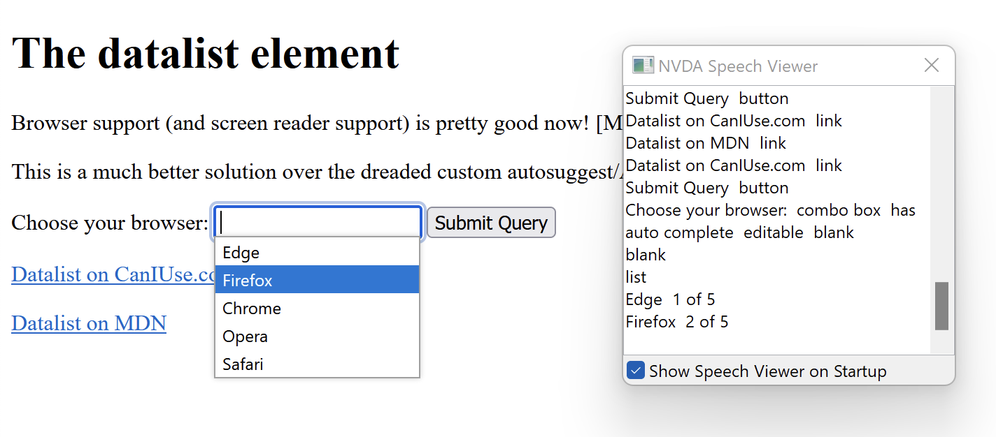
NVDA + Firefox
Upon focus, outputs “Choose your browser: combo box has auto complete editable blank”
Upon opening the option list with the down arrow, outputs “blank” then after down arrow again, “list, Edge 1 of 5”
NVDA + Chrome
Upon focus, outputs “Choose your browser: combo box has auto complete editable blank”
Upon opening the option list with the down arrow, outputs “Autofilllistexpanded, Edge1 of 5″
VoiceOver + Safari
Upon focus, outputs “Choose your browser:, list box pop up, edit text”
Upon opening the option list, outputs “Suggestions list visible”
JAWS + Chrome
Upon focus, outputs “Choose your browser: edit combo. To set the value use the Arrow keys or type the value.”
Upon opening the option list, outputs “Autofill. List box expanded. Edge, 1 of 5. To move to an item press the Arrow keys.”
Navigating the datalist example on the CodePen test page using NVDA on Firefox.
Wrapping Up
Browser support for the HTML datalist element is getting much better, especially on Chrome. Although support isn’t perfect—and nothing is—it’s still pretty good. Is it time to start using datalist instead of heavily customizing similar controls with ARIA? I believe it is, especially considering the vast amount of product development time it would save compared to customization.
In December 2017, results of Screen Reader User Survey #7 by WebAIM were released. The survey was conducted in October and had 1,792 valid responses. The survey had less respondents than the previous survey, but had better world-wide representation.
The second most problematic item is now “Screens or parts of screens that change unexpectedly”. This is surely due to complex designs and SPAs/JS frameworks.
Web accessibility basics (keyboard access, alt text, forms, headings, data tables) are still in top 10 of most problematic.
When asked if more accessible web sites or better assistive technology would have a bigger impact on accessibility, 85.3% responded more accessible web sites.
Sadly, frequent use of landmarks and regions dropped to 30.5%. WebAIM states that this may be “due to infrequent or improper usage of landmarks/regions in pages”.
33.3% reported using Braille output with a screen reader.
41.4% reported using an external keyboard with a mobile device and screen reader.
Digital accessibility experts are often asked about the usage of screen readers and assistive technologies. For example, one will often ask “What’s the most popular screen reader?” This is difficult (if not impossible) to determine technically, but also has privacy implications and other problems.
The following two surveys provide great data and are provided by very reputable organizations. Keep in mind though that the respondents were not controlled and the sample sizes are relatively low.