2014 was surely a much busier year than expected. It started a bit slow, but sure got busy!
In the most recent blog post, the hot topic of Google’s new version of reCaptcha dubbed “No Captcha” was addressed. Although there are remaining challenges, Google’s No Captcha Shows Some Progress.
In the post Floated Labels Still Suck, problems and fixes are discussed for the terrible design pattern of putting input labels inside input fields.
Great progress for accessibility continues in WordPress; a podcast with two WordPress contributors, Joe Dolson (@JoeDolson) and Joseph O’Connor (@accessibleJoe), was published in September.
Web Axe author Dennis Lembree read Steve Krug’s excellent book, “Don’t Make Me Think, Revisited” and Twittered a series of accessibility-related points. The series was published in the post Tweets quoting “Don’t Make Me Think, Revisited”.
In May, I announced that Easy Chirp now provides accessible images for Tweets. This feature is badly needed and isn’t available on any other Twitter app. Unfortunately, and surprisingly, the feature is grossly underused.
In March, we posted a summary of CSUN14, the 29th Annual International Technology and Persons with Disabilities Conference. It was another great event; thanks again to California State University, Northridge. (Look for Dennis at CSUN15!)
On a more personal note, Web Axe author Dennis Lembree released an open-source Accessible HTML5 Video Player in September via his day job at PayPal. He recently changed jobs and is now Product Manager, Accessibility at eBay.
Back in June of 2012, I wrote that the Placeholder Attribute Is Not A Label. The post points out that it’s bad practice to use text to look and behave as a placeholder rather than a label. This is generally known as “floating labels” or “inline labels” (I also call this LAP for short, “labels as placeholders”.) And as you may know, labels are required for accessibility (and usability) as they identify to the user what the input is for. It’s a general best practice to provide a label for every form input.
Unfortunately this design trend still continues even despite repeated concerns on use of placeholder from web development and accessibility experts. Web Axe too maintains that this pattern is bad for a variety of reasons which weren’t fully listed in the original post.
Don’t do this!
Sources of the Problem
Like many accessibility problems on the web, floated labels can be attributed to multiple issues. Firstly, web designs are trendy, and when a huge well-known company does something like floated labels (i.e. Apple), others follow, even if it’s a poor practice. And if usability testing is done and includes floated labels, it may not provide reliable results because the usability testing most likely:
is not done with long forms (which greatly increases the needs reviewing input and increases the potential of losing context)
is not done with users with disabilities
is not done with users with a situational disability
is done most likely in a controlled environment (latest browser provided, no chance for JS delays nor errors, guided by moderator, not a real product)
The web development community has a lack of adequate HTML skills which also contributes to this problem, so bad that articles recommending basic HTML practices must be written, and frankly, are much needed. A fundamental HTML practice is that a text input requires a label to define what it is. The intent of the placeholder attribute is very often misused; the W3C gives an explicit warning about placeholder:
Use of the placeholder attribute as a replacement for a label can reduce the accessibility and usability of the control for a range of users including older users and users with cognitive, mobility, fine motor skill or vision impairments
List of Pitfalls
Whatever the reason floated labels exist, here is a list of potential issues with the pattern.
The simple fact that since the label disappears when entering text, the user may forget what the input is for. This is especially important when reviewing form data; for users with a cognitive accessibility; and people who may be distracted when completing a form.
This pattern can’t support both a label and a placeholder.
Depending on user’s environment and implementation, there may be a delay in rendering/performance: on page load and in text disappearing after beginning typing. Or even it breaking entirely; see the two examples below.
If an HTML5 placeholder is used for label, older browsers and/or assistive technologies may not support it at all. For example, there is no placeholder support in IE9 and Opera Mini.
Placeholder text is rendered differently across browsers/versions; extra design and development is required to make them accessible (color contrast is usually very low) and have consistent styling. The traditional label is straight-forward and reliable.
Developing this pattern in the best way possible can be fairly complicated and is inconsistent among implementations. Code becomes heavier, more fragile, and more difficult to maintain.
The pattern doesn’t support standards; it doesn’t implement HTML elements and attributes as intended. The W3C HTML5 placeholder specification specifically states it should be a “short hint” of user input and states: The placeholder attribute should not be used as an alternative to a label.
A great meme!
In the Wild
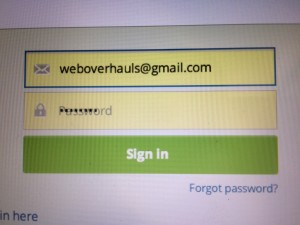
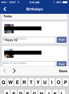
No matter how many issues exist, the fact is that the floated label pattern is prominent on the web. Here are a couple of unique examples of this pattern in the wild which have completely gone wrong. This demonstrates only one of many issues with this pattern; sometimes the label doesn’t disappear visually and the label is blocking the view of the input text.
Hootsuite sign-in fail.Facebook birthday fail in iOS app.
Attempts to Fix
Attempts have been made to help address or fix this problem, but not with much traction. One idea is to ask browsers to darken the placeholder text so that it passes WCAG color contrast requirement. This is a plausible suggestion but not likely to happen, especially any time soon. See below for the CSS fix. And doing so only addresses one issues; it wouldn’t fix the fundamental problem of the label disappearing.
Another attempt is to, upon focus of the input, reduce the text size of the floated label and move it to the bottom of the input field (rather than it disappearing entirely). This is not a feasible solution either as this behavior may cause confusion, requires text size that’s too small, and still adds code weight. Besides, if the label is going to remain visible near the input, it should just be there in the first place.
How to do it right
To create a form that’s robust and accessible, use the label and placeholder as intended:
The label element represents a caption in a user interface. It tells the user what the purpose of the input.
The placeholder attribute represents a short hint (a word or short phrase) intended to aid the user with data entry when the control has no value.
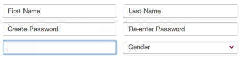
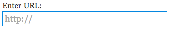
In the example below, the label “Enter URL” clearly indicates what the text input is for. The placeholder “http://” is a short hint as to what text should be entered. Also, a good guideline for placeholder text is similar to title attributes: only use them for supplementary information, not required information.
Example of recommended use of input label and placeholder.
An exception to always displaying a visible label may be the search input where an icon (such as a magnifying glass) and the location of the form on the page visually denotes it’s meaning sufficiently. A visually hidden label is still required.
To better support mobile devices and screen enlarging tools, place the label above the input (as opposed to the left).
If using a placeholder (hopefully for the right reason), use CSS to darken the light grey so that it adequate color contrast. Here’s an example:
::-webkit-input-placeholder { /* WebKit browsers */
    color:    #666;
}
:-moz-placeholder { /* Mozilla Firefox 4 to 18 */
   color:    #666;
   opacity:  1;
}
::-moz-placeholder { /* Mozilla Firefox 19+ */
   color:    #666;
   opacity:  1;
}
:-ms-input-placeholder { /* Internet Explorer 10+ */
   color:    #666;
}
Summary
Please don’t use “floated labels” or “labels as placeholders” technique; it can break the user experience for a large variety of reasons. Use the label element and placeholder attribute as intended. Use CSS to ensure placeholder text has adequate color contrast.
A short while ago, my author @DennisL read the excellent book Don’t Make Me Think, Revisited by acclaimed usability professional Steve Krug. Dennis was so impressed with the book, he tweeted a series with quotes, mostly relating to accessibility (as well as design and usability). So in case you missed it, here they are:
Webpages require a prominent “You Are Here” indicator. ~Don’t Make Me Think Revisited (pgs 77-78) by @SKrug#webdesign#ux#dmmt
So it’s the end of 2013, and sadly, the phrase “click here” continues to be used in text links all around the web. This is poor usability, accessibility, and sure makes the author look silly!
Reasoning
“Click” places focus on mouse mechanics (and many people don’t use a mouse).
“Click here” hides the target of the link; it’s not a good call-to-action.
Poor for visually scanning the page.
Users must make the extra effort to read before or after “Click here” to determine to where the link goes. (Don’t make me think!)
“Click here” has no context for when a list of links is provided to the user by the user agent.
Examples
To correct the problem, don’t use phrases like “click here” but use meaningful phrases which make sense out of context.
Jared Smith (@jared_w_smith) of WebAIM recently launched a clever web page on why carousels are not good practice called Should I Use A Carousel? (which totally went viral on its launch day!) There is a slide deck Keyboard and Interaction Accessibility Techniques (on Slideshare) for which this website was made. I was fortunate enough to see Jared present this at Open Web Camp 5 July 13 at PayPal.
Jared presenting at OWC5
I don’t think that a carousel itself is super terrible. But in my experience, carousels are hardly ever coded with accessibility in mind and hardly ever designed with decent usability. In addition, supporting smaller devices is an issue and coupled with the poor usability data, carousels are overall a bad idea. If you absolutely must implement a carousel, here are some design/interaction tips:
Let the user start the carousel animation.
Give the user the ability to pause the carousel.
Ensure the controls have textual labels.
Ensure the control of the currently displayed panel is indicated visually and programmatically.
Ensure the controls have ample hit areas (for mobile, fine motor disability).
On the development side, a carousel can be challenging to make screen reader accessible. It seems that the most straight forward approach is to use the ARIA tab model which is pretty straight forward and fun to do! Here’s a summary of what to do in the markup:
Each carousel content container has a role of tabpanel.
Each control, typical designed as dots, has a role of tab.
The container of the controls/tabs has a role of tablist.
Add aria-labelledby to the tabpanels which point to the id of the associated control/tab.
To each control/tab, add aria-controls (which points to the id of the associated tabpanel) and aria-selected (boolean) attributes.
Here are some code resources to help make sense of this. This first by Marco may be most relevant: