Categories
tools visual

Accessibility Rendering Tools in Chrome

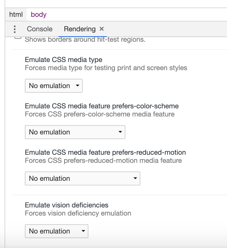
There are a few great simulation tools in Chrome which invoke rendering of a couple CSS media queries and simulate several types of color blindness. These are great for testing the implementation of your accessible design! The features include:

  • Emulate CSS media feature prefers-color-scheme
  • Emulate CSS media feature prefers-reduced motion
  • Emulate vision deficiencies

Unfortunately, they are quite difficult to discover/locate, so here’s where to find them:

  1. In Chrome browser, open the Developer Tools.
  2. Select the “…” menu button in the toolbar.
  3. Select the “More tools” menu.
  4. Select Rendering; the Rendering panel appears in the sub-panel (next to Console if no others are present).
  5. Scroll to the bottom of the Rendering panel to locate the features.
  6. Select an option from the dropdown for each.

Happy developing!

Bottom on rendering sub-panel Chrome

Addendum

Great point by Chris Heilmann via Twitter.

Related

Categories
captcha gov visual

Rock bottom for Captcha, White House

Unbelievable and embarrassing. Is this a new low for CAPTCHA and also for the White House? Let me explain.

In order to sign an online petition by the White House to make books globally accessible to the blind, one must register an account. The fail point is that to register, one must complete a Captcha and the audio version is indecipherable. Therefore, blind folks cannot sign a petition advocating equality for the blind!

A very sad irony.

Here’s an example of the audio Captcha required to decipher in order to register to complete the petition. Because it’s impossible to decipher, the website does not meet Section 508 requirements as the White House claims.

Unfortunately there is still no clear solution to the Captcha accessibility and usability issues. For now it seems a combination of other techniques (see links below) is the best way to go.

Press links:

Articles on Captcha alternatives:

Categories
google screenreader visual

Response to Accessibility in Google Docs

Read Write Web recently published the article Google Announces Sweeping Accessibility Improvements for Visually Challenged Users. On one hand, this is great news. But on the other hand, Google’s accessibility efforts have been inconsistent, and mostly within their own technologies; as we’ll discover below, not implemented for universal use.

The Google Docs updates have been tested by a screen reader user, Kevin Chao. With permission, the following is taken (and slightly edited) from his web post Google announced and took the wraps off what’s been dubbed “enhanced Accessibility in Google Docs”.

Google announced and took the wraps off what’s been dubbed “enhanced accessibility in Google Docs”

Applaud, Thank, and Appreciate

I certainly applaud, appreciate, and praise Google in their accessibility efforts, but there seems to be this level of accessibility, which includes efficiency, effectiveness, and equal access that Google is far from with all attempts, which Docs is no exception.

Dumbed Down Accesssibility limited UI/Look

Visiting Docs.Google.Com using Firefox and NVDA, either classic or new Look/UI, latter is much worse from an accessibility point, but all is relative, including “enhanced accessibility”. Google is always in in a race with itself, changing elements, such as looks/UI. Often there are different views to pick from, and it’s often the one that is “basic” or “classic” that is more accessible, which leaves screen readers with a dumb-downed experience than an equal experience Compared to the full “standard” or “new” UI/look that everyone else who does not need to use a screen has the luxury of using. There should not be more than one view, if there has to be an experimental/enhanced view, it should be accessible, and it’s very degrading that Google by only putting accessibility resources into the dumbed UI/Look implies that all blind screen reader users are unable to perceive, understand, and work with advance, complex, and rich UI/Looks.

Now, let’s move onto the main focus, which is the enhanced Accessibility in Google docs.

Using Firefox, NVDA, and looking at Docs.Google.com in classic view.

Main UI/Look
  • Navigating by form fields or line will reveal lots of unlabeled Controls, such as “button”, clickable, expanded, checkboxes, and clickable list. It’s bad enough from a user interface, experience, and accessibility standpoint that all these controls do not have proper labels, making them accessible, but there’s more.
  • Instructions indicate to get started, activate create new or upload button, but these are identified as clickable, which do not do anything when pressing ENTER. However, with enough attempts of everything under the sun such as NVDA+CTRL+SPACE, SPACE, mouse click, etc.; it will be possible to activate these buttons. It should not be this difficult, frustrating, and require all these work-around to activate buttons (no, no, they are not buttons, but clickable).
  • When navigating to the expand button, pressing ENTER, NVDA is silent. The new status, which is collapsed, is not conveyed from Docs via ARIA or any accessibility event. In addition, arrowing down does not show any additional content. ARIA Live-regions should be used to alert user of updated dynamic content.
  • Navigating to unlabeled button, pressing ENTER, reviewing contents on screen does not show that anything changed.
  • Lots of items are identified as menus and submenus, which when activated do not work as ARIA jQuery menus, but instead do not do anything, cannot track focus/read, and/or it’s not possible to exit menu/submenu.
  • Effective and efficient navigation is lacking greatly, which could Be improved by use of ARIA Landmarks and headings.
Creating/Editing Docs
  • Browse/upload process does not work by simply using arrows/TAB and ENTER/SPACE, but requires the same level of fighting, frustration, and work-around that was required to get into the upload page.
  • Creating a new doc/opening an uploaded one will open it in a new Tab, which is identified with: document title, app, JavaScript, file type, and editable”. While all this is great, arrowing in document reads absolutely nothing and same goes for tabbing around.

Conclusion

Google has optimized Google Chrome, ChromeVox, and Docs to work very well together. This locked-in and non-universal design towards accessibility should be avoided at all possible cause, which results in not as many people using it due to the need to use a different environment for particular task. One of the many benefits to a cloud solution, such as Docs is the anywhere access on anything, which ranges from desktops to mobiles, which Docs accessibility is far from.

Please, Google, there really needs to be real accessibility present, which includes effectiveness, efficiency, and equal level of access. No more of this Google accessibility, which is half-baked at best.

Categories
conference google html5 mobile visual

Accessibility at Google IO 2011

So I attended the first day of Google I/O 2011, my first time at a Google event. I was glad to hear a fair amount of talk about accessibility. There were at least 3 sessions focusing on the topic (see below) and a breakout area where you can talk with developers.

There was even an accessibility “Developer Sandbox” area which was great. I tried out the ChromeVox screen reader on a Chromebook with help from Google’s Rachel Shearer. I got a quick demo of the built-in TalkBack screen reader on an Android mobile device. Mika Pyyhkala and I were shown the LevelStar braille device running Android. The University of Washington showed off their mobile ASL Android project which used video chat technology.

Some tips for Android development from the sessions are:

  • In Android code, ensure images, especially ImageButtons, are labeled with contentDescription.
  • Use standard controls.
  • Stick with standard or modified views; custom very complex to make accessible.
  • Ensure all controls reachable with D-pad and Trackball.
  • Test with screen reader using D-Pad. To turn on, enable accessibility under Settings/Accessibility, then enable Talkback.
  • Take advantage of device’s “many eyes and ears” for alternative input/output (microphone, speaker, touch screen, camera, GPS)

The sessions specific to accessibility were:

More resources:


Tim Credo, Charles Chen, and T.V. Raman on stage at Google I/O.

Categories
browser text visual

No to Text Resize Widgets

Michael Gifford (@mgifford) recently wrote a tweet on text-resizing widgets. It said:

Is it time to scrap text resize widgets and teach people how to resize text http://bit.ly/94jNkv

I totally agree. Say no to text resize widgets. To enlarge text for users, the browser should be used (many reasons below). See this video from OpenConcept on how to text-resize in your browser.

Gifford’s tweet references an article on the subject from almost 3 years ago, Scrap text resize widgets and teach people how to resize text from 456 Berea St. This site had also blogged about the topic a while back in Don’t Use Text Resizing Widgets.

Keep in mind is the issue of misinformation. For example, the very recent article A quick Web Accessibility Checklist actually encourages the use of text resize widgets, or in their words a “Font re-size option”.

Gifford’s tweet sparked many responses with many very good points, which all support why not to implement text-resizing tools on a website. I’ve summarized some reasons from very respectable professionals including @v, @alxp, @johnfoliot, and @ppatel. (Bonus! See slide 12 of Web Accessibility Gone Wild by WebAIM which also discourages the use.)

  • Implementers need to stop setting font to 80% (or lower!) in the default CSS.
  • Text resize widgets only add another layer of complexity on top.
  • Text resize widgets don’t resize text in images.
  • Text resize widgets are site-specific. There’s no standard; each site implements differently.
  • Text resize widgets causes confusion, clutters up the interface.
  • Text resizing is the responsibility of browser; browsers should do this natively. Browsers need a better way to expose this functionality to the user.
  • Users who regularly need larger text have figured this out already on all the sites that lack such a widget.
  • Interface design is not graphic design. Tyrannical control over font size & colors in UI is doing a huge disservice to users.
  • Text resize widgets make the author feel like they are doing good, but only solve problems created by the designer/developer in first place.
  • Not many users I’ve spoken to (@ppatel) use the widgets.