Categories
android conference google presentations review

Google IO12 Review and Accessibility

I was fortunate enough to attend the Google I/O conference again this year (last year’s I/O blog). It was again held at the Moscone Center in downtown San Francisco, California. The opening keynote was a smash hit, and in addition to product announcements, featured skydivers wearing Google Glass!

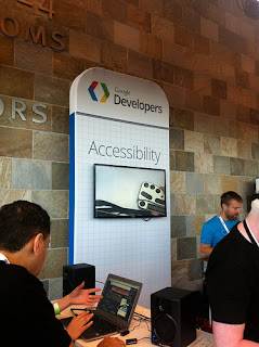
On the second floor, it was a pleasure to meet Phil Strain (@pstr) in person; we’ve followed each other on Twitter for a couple years. He now works for Google and was helping out in the accessibility developer sandbox (booth). He demonstrated the latest ChromeVox. Also at the sandbox, Peter Lundblad demonstrated to me the braille output support using a new Nexus 7 tablet and a Humanware braille display.

Google announced the release of Android Jellybean (4.1) to be released through over-the-air updates to the Galaxy Nexus, Nexus S and Motorola Xoom in July. The announcement came with several Android accessibility enhancements including:

  • Speech recognition is now local to the device, no longer requiring the device to be connected to the Internet in order to use it.
  • Gesture support allowing for greater nonvisual control of the device using the touch screen.
  • Native support for refreshable Bluetooth Braille displays.
  • Source: The Mobile Accessibility Landscape

Session videos

Making Android Apps Accessible with T.V. Raman, Charles Chen, Alan Viverette, Peter Lundblad. Session description:

Android 4.0 introduced platform-level accessibility APIs so that you don’t have to be an expert to make an app that’s accessible to people with disabilities. Come learn how APIs for accessibility make your job easier. We’ll provide code examples covering touch exploration, speech synthesis, multiplatform support through use of a DPAD, magnification for low vision, braille, and more.

Advancing Accessibility for the Web with Rachel Shearer, Dominic Mazzoni, Charles Chen. Includes announcement and demo of the new Chrome Accessibility Developer Tools. Session description:

This session will help you learn through code samples and real world examples how to design and test your web apps for complete accessibility coverage. We will review APIs such as the Text-to-speech (TTS) API, tools like ChromeVox and ChromeShades and how Google products implement solutions today for users with disabilities.

Related links

Tidbits

  • I ran into Peter Hazelhurst, former VP of two of my past employers. Turns out he now is Global Head of Payments, Product Management at Google. He presented on “Introducing Google Wallet Cloud APIs”.
  • It was neat to run into Isabelle Olsson, a lead designer on the Google Glass project, outside the conference center. She had presented in the keynote.
  • The line to get the “free” devices on the first day was incredibly long; wrapped around the entire first floor! I would say it was “unbelievable”, but not too surprising considering three cool toys were being handed out including the new Nexus 7″ tablet.
  • While attending on Wednesday, my wife, kids, and parents (who were visiting from Michigan) had a great time touring downtown San Francisco!
Photo of accessibility sandbox (booth) at Google IO 2012
Categories
articles review

Response to 15+ Tips to Improve Web Accessibility

I gave feedback in the form of a comment for the article 15+ Tips to Improve Web Accessibility of a Website. But, yet again, my blog comment was not published. The article is not bad, just needed some clarifications. So since my comment wasn’t approved (after several days), here it is:

Great points, although 4 have to do with forms. Some clarifications:

  • For alternative text on images, decorative images should have empty value (alt=””) and linked images must have alt text describing target of link.
  • Relative sizing in CSS not as important as it used to be. [Most browser do page zoom by default and all browsers but IE can zoom text set in pixels.]
  • CSS vs table layout doesn’t have any direct impact to accessibility.
  • Use ABBR tag for acronyms as well as abbreviations (acronym tag is deprecated).
  • For skip links, see end of this article for JS fix for functionality on some browsers: http://terrillthompson.com/blog/161

And now that I think about it, the article overlooks pretty basic techniques such as data tables, captioning, and ARIA. For a more complete list of tips, see my 25 Ways To Make Your Website Accessible.

Categories
gov review

Suggestions for the new Disability.gov

Last month (March 2012), Disability.gov (@DisabilityGov) relaunched its website; there is an announcement in its newsletter. I discovered this actually by coming across an article posted on Twitter, A Look behind the Scenes – Part I: Making Disability.gov Accessible which discusses considerations made when developing an accessible website.

Naturally, this peaked my curiosity and was compelled to investigate. I found mixed results. Every website, no matter how great the foundation, is a work in progress and could use improvements. Disability.gov is no exception. Here’s my review of the home page.

  • Heading usage needs improvement. Currently no H1 and only two H2 elements, nothing else. Besides the H1, suggest at least adding headings for the featured/slide content and the Connect section at bottom.
  • In very top section, the elements are keyboard accessible which is great, but the visual placement of print button is out of tab order which makes it a little confusing. (On other pages, three added text links in this area compound the problem.)
  • The “Skip to Page Content” link is good, but needs a JavaScript enhancement for browsers that don’t support the functionality. The fix is explained at end of article Back to Basics: Skip to Main Content Links by @TerrillThompson (which I implemented on Easy Chirp). (Skip-to link is the first of three main features listed on the site’s accessibility statement.)
  • I like the implementation of the search form (besides the 1 extra span in the markup). It uses a visually hidden label and an HTML5 placeholder attribute.
  • High contrast controls are good as the input label and submit button are included. But there are a few issues; the first two mesh with usability. (High contrast is the second of three main features listed on the site’s accessibility statement.)
    • It seems that “Full Graphics” is a poor choice of words for the default state. After all, both states have the graphics.
    • There are only two options, so why have a select dropdown? Unless more options are planned, I suggest using two simple radio options or a single checkbox option.
    • While in high contrast mode, text links in the featured/slide content are unreadable (yellow on white).
  • About the feedback modal/overlay window:
    • After opening, the focus is managed and the feature is keyboard accessible, which is super. But the “Save” button is misleading and confusing. It should simply be “Submit”; the user is not saving the selection for later, but actually submitting his or her response.
    • After closing the feedback modal/overlay window, the keyboard focus is lost. When closing, suggest placing focus on control that opened it (the button “Tell us what you think”).
  • In the non-JavaScript use case:
    • The feedback is missing a submit button (and the button “Tell us what you think” should not be present).
    • The featured/slide content doesn’t degrade well. Most of the slide sections are still visually hidden with no controls to view.
  • There is a visual hover/focus indicator for text links, which is great, but should be more prominent (more obvious, too subtle); it’s currently dark blue text which changes to purple text.
  • The links under Information by Topic have a lot of content in the title attribute. If the content is that long, and especially if it’s important to the user (not “supplementary”), then title attributes are not the best solution.
  • Under News and Events, a title attribute is fine for links in new window, but also need visual indication (icon) and/or include “new window” in anchor (and possibly hide off screen).
  • It’s good practice to declare a language in the HTML element with the lang attribute, in this case, lang=”en-us”.
  • The text-resize widget works, but I see two issues (this is the third of three main features listed on the site’s accessibility statement):
    • The text-resize widget doesn’t resize text specifically; it makes the whole design larger, which is basically the same as browsers’ page zoom feature. So why have the widget? Recommend replacing with real text-size functionality since browsers bury this feature or don’t provide it at all anymore.
    • The hover/focus state of the options in the text-resize widget is so subtle (purple instead of black) that it’s very difficult to notice the change.
  • The options in the “Add This” flyout provides visual feedback with the mouse hover, but is missing keyboard focus.

After completing this review, I unfortunately wouldn’t agree with the claim in the footer that the Disability.gov website adheres to WCAG 2 level AA.

The site’s accessibility statement states:

If you experience any technical problems or have issues with accessibility, please contact dgovdeveloper AT devis DOT com with your feedback, and we’ll do our best to respond to your concerns.

I have emailed a link to a link to this blog and hope more improvements can be made soon. -Dennis

Categories
review

Response to blog Web Accessibility Initiative

This is a response to the blog Web Accessibility Initiative by Nathan Crause. Contrary to the title, the article attempts to disclaim the need for web accessibility, particularly for visual impairments. I submitted a comment but it wasn’t posted. So here it is:

A 3.8% population with visual impairment is not minor at all. If your company has 1 million potential customers, you are ignoring 38,000 chances to make money! And if they’re already customers, be prepared to receive up to 38,000 complaints.

Keep in mind that accessibility also benefits people who have mobile, hearing, and cognitive impairments. They are potential customers, too, and they themselves add up to much more than 3.8% of the U.S. population. The 2009 stats from DisabilityStatistics.org say about 2% of the U.S. population is visually impaired, while total percentage of people who are disabled is around 12%.

Java Applets…seriously?

Content of SVG can be made accessible. And even the accessibility of HTML5 canvas is being worked out.

In addition, Flash can be made accessible. Adobe has made huge improvements here, although not on the Mac. The problem is that developers have the tools to make web sites/apps accessible, but just hardly ever do it.

JavaScript libraries are usually not an issue either. For example, YUI3 and jQuery UI incorporates ARIA which help screen reader users with the interaction.

Still don’t believe me? Check out the W3C’s Developing a Web Accessibility Business Case for Your Organization.

If you current with web technologies, an accessible website doesn’t have to be “crippling”. The bar is now set much higher with modern coding practices available such as progressive enhancement, ARIA, and managing focus. A good example of an accessible web application is Yahoo! email.

The real issue here is ignorance. Ignorance in business, empathy, and proper development technologies and practices. I do agree with you [the author, Nathan] on one point, though; accessibility is a touchy subject.

Categories
design review

Comment on Effective Web Design to Enhance Accessibility

Several days ago, I submitted a comment to the article Effective Web Design to Enhance Accessibility, which was recently going around Twitter. The comment wasn’t published, so here it is:

Proper use of headings is another very important issue.
Comments on points above:

  1. Adequate font size by default is best; 16px ideal, 10 or 12 is unacceptable.
  2. Alternative text is a basic requirement that many folks still miss. Especially important on infographics (and comics!). If too long for alt attribute, just put text on page.
  3. Great point, but “link text” or “link content” may be better use of words. The “title” attribute (a.k.a. tooltip) should only be used for supplemental (and not duplicate) information.
  4. Symbols in addition to color is a good practice. In W3C words, “don’t rely on color alone to convey meaning”.
  5. Be sure to have a label for each form component (and associate correctly). Use Fieldset/Legend for long forms to break in sections.