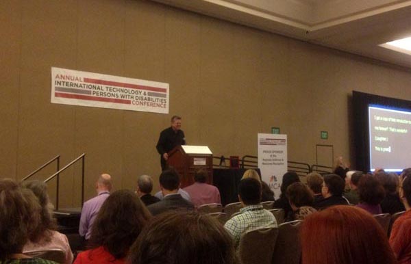
Categories
screenreader

Detecting Screen Readers – No

There has been much discussion about the idea of detecting a screen reader from a website and optimizing the code. In the W3C editor’s draft IndieUI 1.0: User Context, screen reader detection is proposed. This scares me and many others in the web accessibility community.

In the recent publishing of the WebAIM screen reader survey, one of the questions is “How comfortable would you be with allowing web sites to detect whether you are using a screen reader?”. Surprisingly 54% of respondents replied “Very comfortable”. This sure sparked some discussion on Twitter and on blogs.

For the most part, detecting a screen reader has been ill-received from the accessibility community. I am also strongly opposed to this idea.

The reasoning boils down to two issues: development and privacy. And it’s bad for both. Here are some reasons why it’d be bad for development:

  • Text-only websites didn’t work before and you know devs will do this if a mechanism is provided.
  • Screen reader detection is eerily similar to the browser-sniffing technique which has proven to be a poor practice.
  • Maintaining separate channels of code is a nightmare; developers overloaded already with supporting multiple browsers, devices, etc (via RWD). And if done, it will many times become outdated if not entirely forgotten about.
  • Why screen reader detection? If you follow that logic, then detection should be provided for screen magnifiers, braille output devices, onscreen keyboards, voice-recognition, etc. That’s just a bad idea.

Let’s hope screen reader detection is removed from the W3C draft of IndieUI 1.0: User Context.

PS: Interestingly, @LFLegal recently announced that Safeway is (finally) removing a text-only version of its website in the blog Separate is Not Equal: Good News for Grocery Delivery.

Further reading:

Updated August 2023

Categories
conference csun event podcast

Podcast #99: Jennison Powers Up Silicon Valley

Dennis speaks with @Jennison Asuncion about his big move to Silicon Valley from Toronto, new Meetup groups and camps, CSUN14 and other fun things.

Download Web Axe Episode 99 (Jennison Powers Up Silicon Valley)

[transcript of podcast 99]

Event announcements:

More new groups:

Tidbits:

Categories
html5 video

Vimeo Updates Video Player Including Accessibility

Vimeo, a YouTube competitor, has recently updated its web-based video player. Vimeo now defaults to an HTML5-based player rather than Flash. It provides much faster playback/load times and improved tools to share a video.

Vimeo logo

Although the accessibility implementation may not be perfect, it’s a very significant improvement. The Vimeo player now supports keyboard and screen reader users and supports captions and subtitles! Here’s a live example of Vimeo captions by Amara (@AmaraSubs).

Thanks to Vimeo for these changes. We hope to hear about more improvements.

Further reading:

Categories
roundup

2013 Year in Review

It was a steady (but relatively slower) year for Web Axe. Besides some blogging, I managed 2 podcasts, Twittered a lot, and maintained the Facebook page. All-in-all 2013 was a great year, with more than enough things to review; here are some:

Do you have anything special to share from this past year?

Categories
links usability writing

Links: Don’t “Click Here”

So it’s the end of 2013, and sadly, the phrase “click here” continues to be used in text links all around the web. This is poor usability, accessibility, and sure makes the author look silly!

Reasoning

  • “Click” places focus on mouse mechanics (and many people don’t use a mouse).
  • “Click here” hides the target of the link; it’s not a good call-to-action.
  • Poor for visually scanning the page.
  • Users must make the extra effort to read before or after “Click here” to determine to where the link goes. (Don’t make me think!)
  • “Click here” has no context for when a list of links is provided to the user by the user agent.

Examples

To correct the problem, don’t use phrases like “click here” but use meaningful phrases which make sense out of context.

Before: I like the beaches herehere, and here.
After: I like the beaches in Maui, Sarasota, and Saugatuck.

Before: Click here to see if your bill is ready yet.
After: To see if your bill is ready, check the foo app.

Do you have any other examples?

Supporting articles

  1. Why Your Links Should Never Say “Click Here” (Smashing Magazine)
  2. I Don’t Want to Read More or Click Here (Karen Mardahl)
  3. Don’t say ‘click here’ on link text (goodusability.co.uk)
  4. Links and Hypertext (WebAIM)
  5. Click Here and Other Link Text (Jim Thatcher)

Notes

  • In addition to “click here”, the same can be said for “read more” and other similar link phrases.
  • Except for tool tips available to mouse users, the title attribute adds no value (touch devices, keyboard users, most screen reader users).