- Assistive Technology Specialist at Southern New Hampshire University in Manchester, NH.
- Quality Assurance Tester – Section 508 Compliance in New York, NY.
- Sales Engineer for the Accessibility Management Platform at SSB Bart Group in Manchester, NH.
- Sr. Product Manager, Accessibility wanted at eBay in San Jose, CA.
- Web User Interface Analyst (direct hire) at Modis in Vienna VA.
- iOS developer at American Printing House for the Blind in Louisville, KY.
- Senior Technical Program Manager, Accessibility at Microsoft in Redmond, WA.
- Adaptive Technology Specialist at Riverside City College in Riverside CA.
- QA Accessibility Tester at Enterprise Solutions in Mountain View, CA.
- Web Accessibility Software Engineer at Apple in Santa Clara Valley, CA.
- Android Software Engineer – Mobile Accessibility at Twitter in San Francisco, CA. Can also contact @Sommer on Twitter!
Author: Dennis
Over the last year or so, a design trend in the web and mobile world has been transition animations, parallax effects, and the like. For many users, this can cause vestibular issues; the symptom is usually vertigo, or a feeling of motion sickness.
The issue was not well recognized until iOS 7 was released and overwhelmed users with an excessive amount of visual effects, especially parallax. Numerous articles were written about this issue, including iOS 7 and motion sickness by iMore. In a poll displayed on that article, about 28% of users reported having either mild or serious motion sickness with iOS7; this is not a formal study but still makes quite a statement. And at the time of writing, there are 100 comments on the article!
Pro tip! To reduce the parallax effect in iOS 7, go to Settings > General > Accessibility > Reduce Motion.
Pros and Cons
A study by Purdue University found that “although parallax scrolling enhanced certain aspects of the user experience, it did not necessarily improve the overall user experience”. Let’s take a look of pros and cons of parallax design.
Pros:
- May possibly increase user engagement.
Cons:
- Makes many users sick.
- Requires additional code which makes web pages more complex longer to load.
- Does not function smoothly across all browsers.
- Difficult to implement with responsive and mobile design.
- Can make it difficult or frustrating for the user to consume content due to excessive scrolling.
Recommendation
There are obviously many more negative points for using parallax design as there are positive. My recommendations are:
- Use parallax effects (and animations) with much discretion and tolerance, if at all.
- Ensure complete browser testing on desktop as well as mobile devices.
UPDATE: The CSS Reduced Motion Media Query can now be used to turn off (or reduce) animation and motion effects when a user has the setting on in the user agent, if supported.
Related Articles
- Why iOS 7 is making some users sick by The Guardian
- How the parallax effect is used in web design by TechRepublic
- A Primer To Vestibular Disorders by The Accessibility Project
- What are the symptoms of a vestibular disorder? by Vestibular Disorders Association (VEDA)
- Added Sep. 22: Balance Awareness Week and iOS8, a Storify by @Feather
- Added Sep. 23: Animation for Attention and Comprehension by Nielsen Norman Group
- Added Aug. 2015: Infinite Canvas 6: Vestibular Disorders and Accessible Animation (YouTube)
- Added Mar. 2018: Your Interactive Makes Me Sick by Eileen Webb.
- Added Dec. 2018: A Guide to Creating Accessible Animations by Anna Monus.
- Accessibility for Vestibular Disorders: How My Temporary Disability Changed My Perspective (Apr. 2019)
- Accessible Web Animation: The WCAG on Animation Explained (Sep. 2020)
- Designing With Reduced Motion For Motion Sensitivities (Sep. 2020)
- Why Motion on Websites and Digital Content Is a Problem (Dec. 2021)
- Creating Accessible UI Animations (Nov. 2023)
- Motion, parallax, and web accessibility (Oct. 2024?) by Indiana University
Related Tweets
iOS7 animations causing vertigo for some users: http://t.co/M4NASpmgc6 Given Apple #a11y focus, “disable animations” quick fix? Like IE has?
— Adrian Roselli (@aardrian) September 28, 2013
Use animation in #webdesign with caution/moderation; be sensitive to users with vestibular sensitivity: http://t.co/nqEr2Btwgp #a11y
— Web Axe (@webaxe) July 15, 2014
Web animations & parallax make people with vestibular issues sick! The only way they can turn them off is to disable CSS & JavaScript. #a11y
— Jeffrey Zeldman (@zeldman) July 25, 2014
@heydonworks @dennisl @aardrian Vestibular Disorders are a *real* concern http://t.co/2sb5CkAyK0 — Steve Buell (@SteveBuell) September 19, 2014
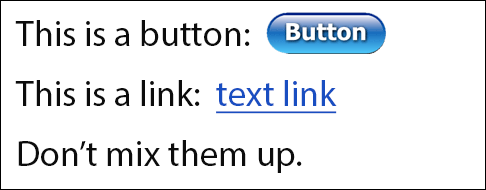
After years of arguing for proper use of form elements and link elements, others are finally doing the same. More recently, this includes the articles The Anchor Button: Bad for Accessibility, Bad for Usability by Matt Long and Reinventing the hyperlink (with much humor!) by Heydon Pickering.
The main point is, please do the basics. When designing a website, ensure controls with button-type behavior (submitting form and opening a modal dialog) are designed as buttons and regular text links (go to an external page, anchor on page, or external document) are designed like text links (such as blue underlined text).
When developing a website, ensure buttons are coded as buttons (the button or input element) and links are coded as links (the anchor element). You could also use ARIA roles to denote button and link, but it’s always better to use the semantic HTML elements.
Here are some reasons why it’s so important:
- accessibility and usability
- provides user with expectation of the control’s behavior
- avoid conflicts with voice-control user agents (speech recognition software) such as Dragon NaturallySpeaking
- a more robust website (support older user agents, non-JS, etc.)
- lighter and less complex code
- more consistent implementation so easier to maintain
Remember that for accessibility, no matter how much ARIA and trickery is done, there will mostly likely still be problems. When blurring the distinction between a button and a link, assistive technology (and/or the user) can be confused as to what’s what. View the beginning of this presentation by Derek Featherstone for a good example of this.
This advice sounds simple, but this elementary guideline is broken quite often; once you start to look, you’ll find it everywhere on the web, especially web apps. There’s no need to create confusion (the design) and to re-invent the wheel (the development). Sticking to the basics will make it easier for everyone, most importantly the user.
For an example of proper implementation, check out Easy Chirp.
Further reading:
- What ARIA does not do by Steve Faulkner (Aug. 2014)
- The Enter Key should Submit Forms, Stop Suppressing it by TJ VanToll (Jan. 2013)
- HTML5 Accessibility Chops: the placeholder attribute by Steve Faulkner (2011, updated 2013)
- You can’t create a button by Nicholas Zakas (Jan. 2013)
- Placeholder Attribute Is Not A Label! (June 2012)
- “Don’t hide your affordances under a bushel” p151 of Don’t Make Me Think Revisited by Steve Krug
Addendum:
- How Our CSS Framework Helps Enforce Accessibility by eBay/Ian McBurnie (Nov. 2014)
- Links, Buttons, Submits, and Divs, Oh Hell by @aardrian (Jan 2016)
- When To Use The Button Element by CSS-Tricks (Jan. 2014)
- But sometimes links look like buttons by Adam Silver (Sep. 2017)
- Anchors, Buttons, And Accessibility by Alex Lande (May 2014)
- Links vs. Buttons in Modern Web Applications by Marcy Sutton (July 2016)
- Enough with the role-play—let’s get back to the basics by Ian Lloyd
- Designing and Coding for Voice by Brian DeConinck (Apr. 2023)
Last updated April 2023.
Wanted (all in U.S.):
- Visual information designer with WCAG skills in Princeton, NJ.
- Architect Manager – Accessibility Specialist at Modis in NYC.
- Accessibility Specialist in San Francisco, CA.
- Human Computer Interaction Developer with JAWS experience in Fairfax, VA.
- Coordinator of Academic Accessibility at University of Virginia in Charlottesville, VA.
- Accessibility Engineer at Oracle in Nashua or Burlington, MA.
- Section 508 Web Compliance/Web Accessibility Analyst at Turas Group in Roanoke, Virginia.
- Accessibility Consultant and Tester at IBM.
- Web Accessibility Advisor (Section 508 Specialist) at BCBS-NC in Durham, NC.
- iOS Software Accessibility Engineer at Apple in Santa Clara, CA.
- Front-End Engineer, Accessibility at Yahoo in Sunnyvale, CA.
- Added July 30: Information Accessibility Specialist for State of Minnesota in St. Paul, MN.
- Added July 31: Accessibility Specialist for Instructional Web Content at Michigan State University in East Lansing, MI.
- Added July 31: Accessibility Specialist in Wilmington, DE.
- Added Aug 2: CEO for IAAP! Chief Executive Officer, International Association of Accessibility Professionals
To learn of new positions, remember to follow me (@webaxe), @accessible_jobs and @a11yJobs on Twitter!
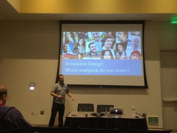
Recently I attended Open Web Camp 6 (@OpenWebCamp) at the beautiful PayPal headquarters in sunny San Jose, California. Like every year, the event is coordinated by @JohnFoliot. If you want to review the Twitter feed, the hash tag is #OWC6.
Like last year, the cost of the event was only $10, and attendees get a nice lunch, a t-shirt, and some other swag. The networking was good and the energy was great!
There was a variety of topics but accessibility was the most prominent. Here are the highlights:
- Derek Featherstone (@feather) presented Accessible Design: Which “everyone” do you mean? where he discussed accessibility challenges for users of assistive technology such as voice recognition and screen magnifiers.
- Dylan Wilbanks (@dylanw) presented a thought-provoking session Meditations on making fire-proof, failure-proof, future-proof things.
- Dirk @Ginader presented Teach your Browser new tricks where he discusses longdesc and browser extensions.
- @KarlGroves spoke about accessibility testing and his app Tenon.
- The Twitter talk “Connecting to the pulse of the planet” was disappointing. It was much more of a 25-minute sales pitch than a tech talk.
All in all, it was another successful web event. Hoping for an OWC7!
Factoid: I’ve attended every OWC event since its inception at the first Open Web Camp at Stanford, and spoke about the then newly created @EasyChirp (then called Accessible Twitter).