Categories
code css

We Don’t Need A Native .visually-hidden

Some web professionals say that The Web Needs a Native .visually-hidden. I respectfully disagree, particularly as a matter of priority.

A visually-hidden CSS class, as it’s often named, is used to visually hide textual content from sighted users but expose it to screen reader users. This is a common practice in web development, too common in my opinion. Another name for the class you’ll come across is “sr-only” (which I believe stemmed from Bootstrap but was modified in version 5). The properties of the class are complex and implemented in different ways.

So technically, this may be true—a native HTML attribute for the same functionality would be somewhat useful. But it’s not anywhere near the importance of other, more foundational needs. My point is that, in the big picture, a native visually-hidden should be much, much lower on the priority list. So low that it’s a bit discouraging to hear folks requesting it.

What the web really, greatly needs is the following:

  • Web developers who practice semantic HTML.
  • Designers who don’t want to customize every single UI element.
  • VPs who prioritize usability and accessibility.
  • Designers and VPs who prioritize usability and accessibility over the latest visual design trends (which most of the time cause accessibility problems).
  • A lot less adverts, pop-ups, notifications, and other UI shyte.

These fundamental needs will go tremendously further for usability and accessibility than any HTML attribute, ARIA attribute, automated testing tool, Figma plugin, etc.

Also, as web professionals, we don’t want to encourage the use of visually hidden text but discourage the use — in favor of universal design, creating the same design and experience for all users. This will also save a lot of time and hassle during the SDLC.

Further reading:

Categories
code design roundup

Web Accessible Code Libraries and Design Patterns

Within a web development organization, it’s ideal to maintain (and enforce usage of) design patterns and a components library. And they should work together; design patterns create consistency among visual elements across projects and the components library creates consistent implementation of those patterns during development. This is especially important on several levels including accessibility.

Here is an extensive list of recommended code libraries, patterns, and design systems. It’s one list instead of separating by category as many have elements of each. There are also some related articles below. Please leave a comment for any updates, corrections, additions, etc.

Related resources:

Categories
code design

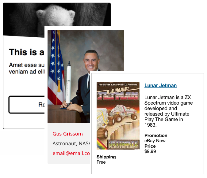
Resources for developing accessible cards/tiles

The card pattern (also know as tiles and blades) has become quite popular over the last several years. There are many accessibility challenges that may arise quickly when web developers attempt to build them including:

  • Providing keyboard access
  • Providing an adequate visible focus indicator
  • Link text that’s not overly verbose for screen reader users
  • Using correct semantic markup, especially for the heading
  • Maintaining proper reading order
  • Not duplicating content
  • Making entire card a hit area for pointing devices

Here are a several great resources on building accessible cards/tiles and address these issues:

collage of 3 tiles

Categories
code navigation podcast semantic

Podcast #37: Code Considerations for Web Accessibility

Dennis and Ross discuss various techniques on coding for web accessibility (in follow up to Podcast #34: Design Considerations for Web Accessibility). Topics include:

Download Web Axe Episode 37 (Code Considerations for Accessibility)

News

Links

Categories
code color design layout navigation podcast text

Podcast #34: Design Considerations for Accessibility

Considerations for designing an accessible web site, including discussion on web site conventions, navigation, color, text, and layout.

Download Web Axe Episode 34 (Design Considerations for Accessibility)

[Transcript for Web Axe 34]

Stick to Conventions

  • Search upper right
  • Global navigation across top
  • Sub navigation on sides
  • Icons

Navigation Considerations

  • Skip navigation
  • Indicate visited pages, current page
  • Use breadcrumbs where possible

Color Considerations

  • Ensure enough color contrast
  • Light on dark, or dark on light?
  • If you change the color of an anchor state, change them all
  • Never use color to convey information

Layout Considerations

  • If you have a low vision/large text style sheet, convert layout to one column
  • Pay attention to if it is obvious you can scroll downward or not
  • If Article is broken up between several pages, provide a link to a single page with the whole article for easy printing
  • Try and design for 760px minimum width

Text Considerations

  • Sans-serif fonts are generally easier to read on a screen
    • Print serif fonts are, but light reflects off of paper where screen illuminates light
  • Text Sizing
    • Ensure font can be enlarged with out breaking the design
    • Headers should be larger than regular text (to indicate more importance)
    • Fonts should be decent size, not everyone knows how to resize text

Other Considerations

  • Limit the use of Flash
  • Print Style Sheets
  • Graphical buttons should be text with graphical backgrounds (for sizing without pixelation)
  • Include an access guide, or site help
  • No flickering
  • Audio–plan for text-only version and links
  • Video–plan for real-time captioning