Summary: This article suggests that the custom select dropdown is overused. The ARIA combobox pattern to create one is very complex and has inconsistent support. Instead, the native HTML datalist element should be leveraged to create a similar UI control, and its support is pretty good. Code snippets, keyboard testing results, and basic screen reader testing results are provided.
Customizing a Select is not ideal
Due to extreme complexity, and usually spotty accessibility support, customizing an HTML select element is not recommended. There have been many noble attempts, but at the end of the day, it’s just not worth the many, many hours that web designers and developers and testers dedicate to this. And often it’s not needed; much of its demand is due to ill-perceived competition and designer narcissism. It’s always better to use native HTML.
Autosuggest adds even more complexity to the problem of customizing a native HTML select. The ARIA combobox pattern is appropriate for implementing autosuggest, but it’s inconsistent between ARIA versions, very intricate to implement, and there are many nuances and different levels of support by browsers and screen readers.
Enter datalist
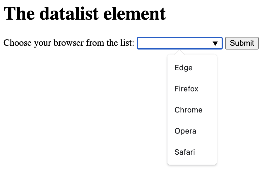
We can address this issue by simply implementing the native datalist HTML element in conjunction with an input element. Doing so (and not customizing via ARIA) eliminates a huge amount of code complexity, code weight, design inconsistency, testing time, etc. The result is a control which functions like an autosuggest dropdown and text can also be entered into the input field.
The datalist element is defined in the spec as:
a set of option elements that represent predefined options for other controls. In the rendering, the datalist element represents nothing and it, along with its children, should be hidden.

Datalist support
Datalist has been around for years now, but only recently has browser support and its accessibility been good enough to consider using. Check out datalist on CanIUse.com for info on browser support (that’s a lot of green!)
In a recent Tweet from Paul Adam, he states “HTML <datalist> Tag seems accessible enough now to recommend over an ARIA combobox”. Support could be improved (see testing results below), but all things considered, I agree. His tweet includes a screenshot of VoiceOver using the element, with Safari it appears.
HTML <datalist> Tag seems accessible enough now to recommend over an ARIA combobox. #a11y https://t.co/ndcRQjvPS7 pic.twitter.com/zNkTRm3bCd
— Paul J. Adam (@pauljadam) May 23, 2023
Simple is good
The beauty of the datalist element is simplicity. Straight forward, semantic, and simple HTML – and no JavaScript needed! Here is an example – a label, an input, and the programmatically associated datalist element which contains the options.
<label for="browser">Choose your browser from the list:</label>
<input list="browsers" name="browser" id="browser">
<datalist id="browsers">
  <option value="Edge">
  <option value="Firefox">
  <option value="Chrome">
  <option value="Opera">
  <option value="Safari">
</datalist>
Testing datalist
I’ve done some keyboard and screen reader testing using this datalist test page on CodePen. Support isn’t perfect, but overall it’s pretty good!
Keyboard testing results
After testing with Chrome, Firefox, and Safari, it seems Chrome on both Mac and Windows provides the best keyboard support.
- Chrome (Mac and Windows):
- Caret icon appears on focus
- Option list appears when typing (option list also appears on focus)
- Option list appears via spacebar
- Option list appears via down arrow
- Arrow + Enter to select an option
- Escape closes the option list
- Firefox (Mac and Windows):
- Caret icon NOT displayed on focus nor by default
- Option list appears when typing
- Option list DOESN’T appear via spacebar
- Option list appears via down arrow
- Arrow + Enter to select an option
- Escape closes the option list
- Safari:
- Caret icon displayed by default
- Option list appears when typing
- Option list DOESN’T appear via spacebar (note that with VoiceOver on, it appears with VO + spacebar)
- Option list DOESN’T appear via down arrow
- Arrow + Enter to select an option
- Escape DOESN’T close the option list
Screen reader testing results
Screen reader usability seems adequate but could use improvement. Here are a few details. No mobile testing was done.
- NVDA + Firefox
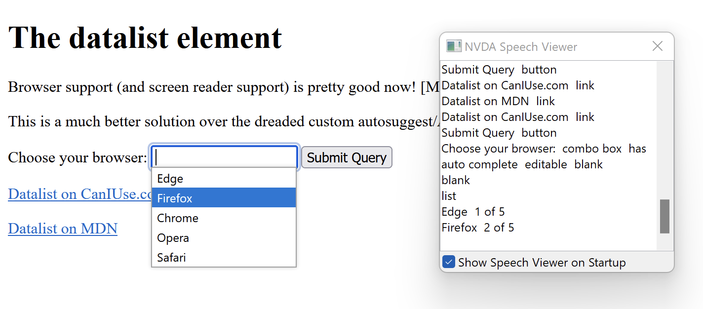
- Upon focus, outputs “Choose your browser: combo box has auto complete editable blank”
- Upon opening the option list with the down arrow, outputs “blank” then after down arrow again, “list, Edge 1 of 5”
- NVDA + Chrome
- Upon focus, outputs “Choose your browser: combo box has auto complete editable blank”
- Upon opening the option list with the down arrow, outputs “Autofill list expanded, Edge 1 of 5″
- VoiceOver + Safari
- Upon focus, outputs “Choose your browser:, list box pop up, edit text”
- Upon opening the option list, outputs “Suggestions list visible”
- JAWS + Chrome
- Upon focus, outputs “Choose your browser: edit combo. To set the value use the Arrow keys or type the value.”
- Upon opening the option list, outputs “Autofill. List box expanded. Edge, 1 of 5. To move to an item press the Arrow keys.”

Wrapping Up
Browser support for the HTML datalist element is getting much better, especially on Chrome. Although support isn’t perfect—and nothing is—it’s still pretty good. Is it time to start using datalist instead of heavily customizing similar controls with ARIA? I believe it is, especially considering the vast amount of product development time it would save compared to customization.
Further reading
- ADDED: Under-Engineered Comboboxen? by Adrian Roselli
- ADDED: Accessible “Chips” Pattern demo using <datalist>
- Datalist on MDN
- datalist-polyfill
- Accessible Autosuggest Dropdown pattern
- <select> your poison by Sarah Higley
- Be Careful Using ‘Menu’ by Adrian Roselli

