Like Web Axe? Get your Web Axe gear on RedBubble! Always good to promote web accessibility with a little swag/merchandise!
Currently available: t-shirts, hoodies, mugs, stickers, notebooks
Like Web Axe? Get your Web Axe gear on RedBubble! Always good to promote web accessibility with a little swag/merchandise!
Currently available: t-shirts, hoodies, mugs, stickers, notebooks
Many great opportunities are available in the digital accessibility field.
Follow me, @a11yJobs, and @LyndonDunbar on Twitter for more!

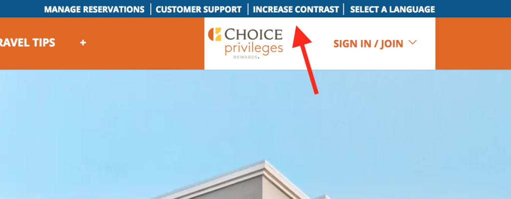
Most of use are aware of the color contrast guideline in WCAG 2.0 AA which states:
1.4.3 Contrast (Minimum): The visual presentation of text and images of text has a contrast ratio of at least 4.5:1, except for the following: (Level AA)
This can be a big problem for websites when the color scheme uses the brand colors which do not meet the above requirement. This can be especially troublesome for medium orange and green tones.
A technique to meet this guideline is G174:
Providing a control with a sufficient contrast ratio that allows users to switch to a presentation that uses sufficient contrast
You may want (or need) to consider this technique for your website, at least temporarily. The control for this option should be in a global nav bar or settings (if available). A longer term goal is to correct your brand’s colors so that it meets the 4.5:1 color contrast requirement.
Here are some examples of websites that have a high contrast option available (the control is in the top horizontal bar in all examples).